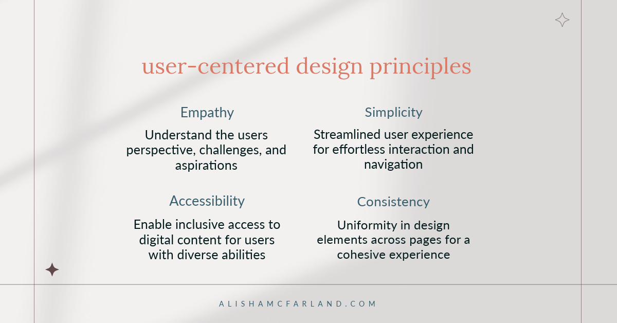
Want to create a website that captivates and keeps visitors coming back? “Creating Websites People Love: Ways to Give Visitors What They Want” reveals how to do that. This article breaks down four essential principles—empathy, simplicity, accessibility, and consistency—that will transform your web design approach. By the end, you’ll know how to:
- Connect with your audience on a deeper level
- Streamline your site for a better user experience
- Make your content accessible to everyone
- Build a cohesive online presence that users trust
Whether you’re a novice or a pro, these insights will help you craft websites that resonate with your visitors and drive results.
Designing With Empathy
Empathy is about putting yourself in your visitors’ shoes and creating an experience that resonates with their needs, emotions, and circumstances.
Understanding user needs and emotions
To design with empathy, start by understanding your users.
- What are their goals when visiting your site?
- What frustrations might they face?
- What emotional states might they be in?
To gain these insights, conduct user research through surveys, interviews, or analytics.
Creating personas to guide design decisions
Develop detailed user personas based on your research. These fictional characters represent your typical users and help you make design choices that cater to real people, not abstract concepts. Include your personas’ demographics, goals, pain points, and behavioral patterns.
Implementing user feedback
Collect and act on user feedback regularly. This could be through surveys, user testing sessions, or analyzing customer support inquiries. Use this information to refine your design and address pain points continually.
Empathy Example
A food delivery website that offers a “comfort food” category during stressful times like exam periods or holidays.
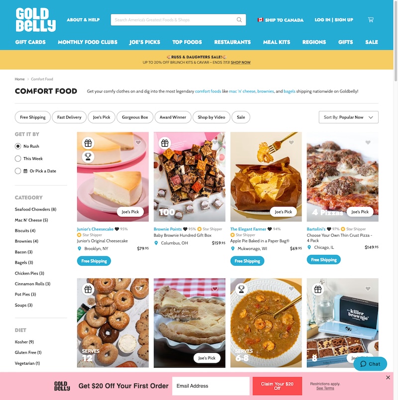
Imagine a food delivery service that has researched its user base and created personas like “Stressed Student Sarah.”
Understanding that many of their users are students who often feel stressed or homesick, they implement a dynamic “Comfort Food” category on their website. This category becomes prominent during stressful periods like exam seasons or major holidays.
The comfort food section might feature:
- Nostalgic dishes from various cultures
- Hearty, warming meals
- Special discounts on these items during high-stress periods
- User-generated content sharing stories about their favorite comfort foods
This website goes beyond mere functionality by anticipating and responding to users’ emotional needs. It creates an emotional connection, showing users that the company understands and cares about their situations.
Remember, empathy in web design isn’t just about solving problems—it’s about creating experiences that resonate on a human level.
Embracing Simplicity
Simplicity is not just an aesthetic choice—it’s a powerful tool for enhancing user experience. A simple design lessens mental effort, allowing visitors to find what they need and achieve their goals easily.
Streamlining navigation and content
Simplify your site structure by organizing content logically and reducing the number of menu items. Use clear hierarchies and group-related information. Eliminate unnecessary pages or features that don’t serve your core user needs.
Using clear and concise language
Write in plain, easily understandable language. Avoid jargon or complex terms unless necessary for your audience. Use short sentences and paragraphs. Break up text with headings, bullet points, and white space to improve readability.
Implementing intuitive user interfaces
Design interfaces that feel natural and require minimal learning. Use familiar design patterns and icons. Ensure that interactive elements like buttons and links are easily recognizable and provide clear feedback.
Simplicity Example
An e-commerce site with a minimalist design featuring large product images and a prominent, easy-to-use search function
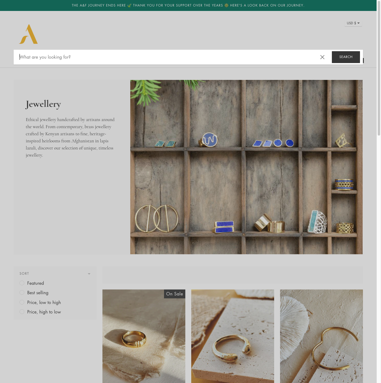
Consider an e-commerce site selling handcrafted jewelry. Here’s how it embraces simplicity:
- Clean, uncluttered homepage:
- Large, high-quality product images take center stage
- Minimal text, focusing on key selling points
- Simple navigation with categories like “Necklaces,” “Rings,” and “Earrings.”
- Prominent search bar:
- Positioned at the top of every page
- Autocomplete feature for faster searching
- Option to filter results by price, material, or style
- Streamlined product pages:
- Large, zoomable product images
- Clear, concise product descriptions
- Simple “Add to Cart” button in a contrasting color
- Easy checkout process:
- Progress indicator showing steps in the purchase process
- Option for guest checkout to reduce friction
- Clear calls-to-action at each step
By embracing simplicity, this e-commerce site allows the products to shine while making the shopping experience effortless. The intuitive design guides users smoothly from browsing to purchase, reducing abandonment rates and increasing customer satisfaction.
Remember, simplicity doesn’t mean lacking features or being boring. It’s about presenting information and functionality in the clearest, most user-friendly way possible. A simple design can be visually striking and highly effective.
Ensuring Accessibility
Accessibility in web design means creating websites that everyone can use, regardless of their abilities or devices. It’s not just about compliance with regulations; it’s about inclusivity and expanding your audience.
Designing for users with disabilities
Consider various disabilities, including visual, auditory, motor, and cognitive impairments. Use alternative text for images, provide video captions, and ensure your site works with screen readers. Structure your content with proper heading levels to aid navigation for users who can’t see the visual hierarchy.
Implementing keyboard navigation
Ensure all functions of your website can be accessed using only a keyboard. This helps users with motor impairments who can’t use a mouse and power users who prefer keyboard shortcuts. Ensure the tab order is logical and the current focus is always visible.
Using appropriate color contrast and font sizes
Choose color combinations with sufficient contrast to make text readable for users with visual impairments or color blindness. Use tools like webaim.org to check your color contrast ratios. Opt for legible font sizes and allow users to resize text without breaking the layout.
Accessibility Example
A news website that offers text-to-speech functionality for visually impaired users
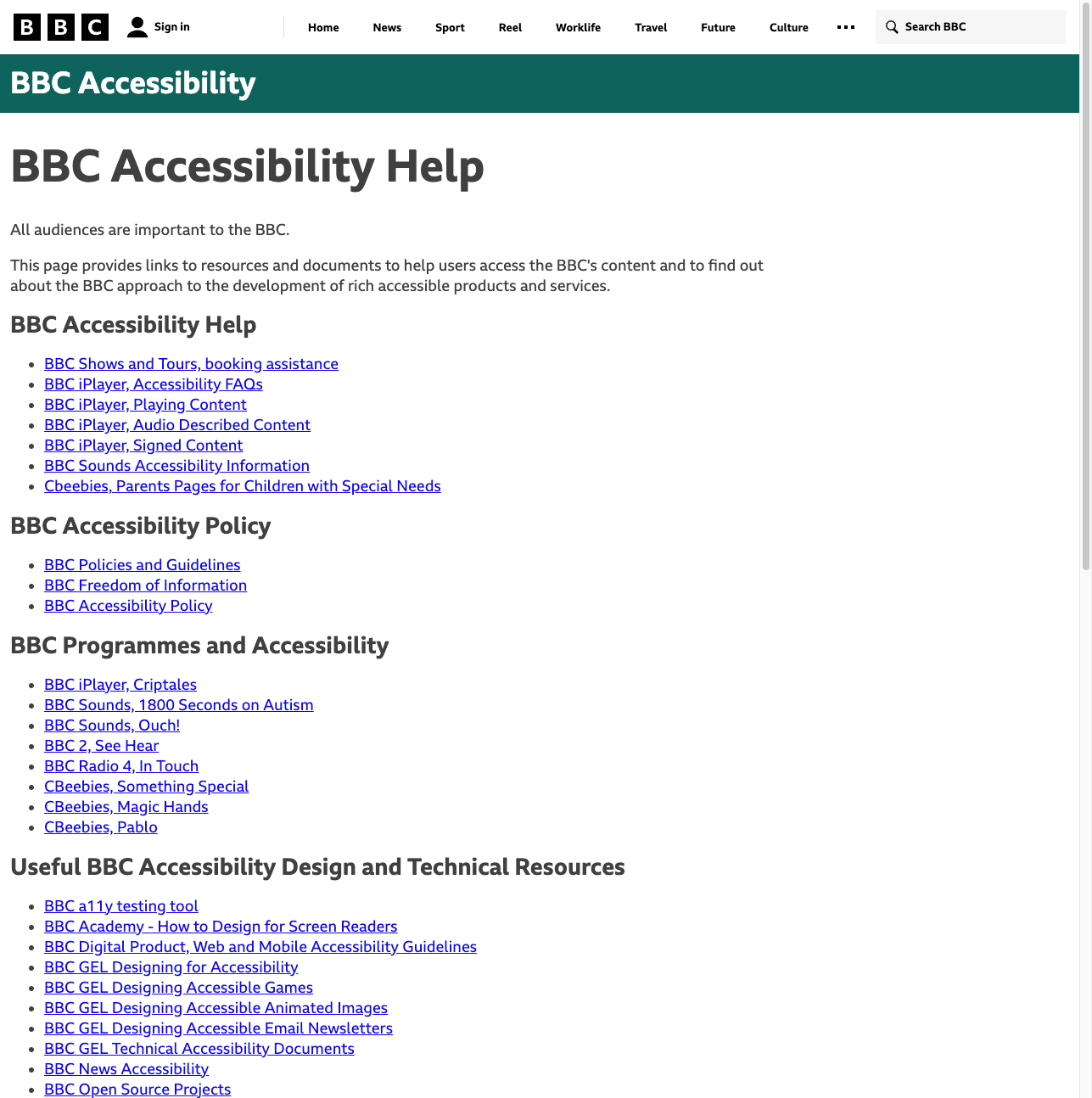
Imagine a news website committed to accessibility:
- Text-to-speech feature:
- A prominent button to activate text-to-speech on every article
- Options to adjust reading speed and voice
- Ability to pause, resume, and skip sections
- Keyboard navigation:
- Clear focus indicators as users tab through the site
- Keyboard shortcuts for common actions (e.g., ‘N’ for next article)
- Visual design:
- High contrast between text and background
- Ability to switch to a high-contrast mode
- Scalable text that doesn’t overlap when enlarged
- Structure and content:
- Proper use of heading levels for easy navigation
- Descriptive alt text for all images
- Transcripts provided for video content
By implementing these features, the news website ensures its content is available to a wider audience, including those with visual impairments, motor disabilities, or reading difficulties. This approach not only serves users with permanent disabilities but also helps those with temporary limitations, like someone trying to read the news while in a noisy environment.
Remember, accessible design often leads to better design for everyone. Features implemented for accessibility, like clear navigation and legible text, improve the experience for all users.
Maintaining Consistency
Consistency in web design creates a sense of reliability and professionalism. It helps users easily navigate your site and builds trust in your brand.
Creating a cohesive visual identity
Develop and adhere to a clear style guide. This should include consistent use of colors, fonts, button styles, and imagery across your site. A cohesive visual identity looks professional and helps users quickly recognize and understand different elements of your site.
Using consistent language and tone across pages
Maintain a uniform voice in your content. Whether your brand’s tone is formal, friendly, or somewhere in between, it should remain consistent throughout the site. This includes using the same terminology for key concepts and features.
Ensuring predictable user interactions
Design interactive elements to behave consistently across your site. For example, links should always be styled similarly, and buttons should respond similarly when clicked. This predictability reduces users’ learning curve and makes navigation more intuitive.
Consistency Example
A social media platform that maintains the same layout and button positions across different site sections.
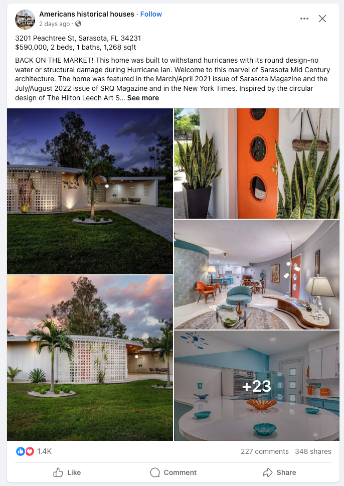
Consider a social media platform designed with consistency in mind:
- Consistent layout:
- Main navigation always appears in the same place (e.g., left sidebar)
- Profile information is consistently positioned (e.g., top right corner)
- The content area maintains the same width and positioning across pages
- Uniform interactive elements:
- Like, comment, and share buttons are always in the same order beneath posts
- Consistent icons used for actions (e.g., a bell for notifications)
- Hover and click effects remain the same across all clickable elements
- Cohesive visual design:
- The color scheme is applied consistently (e.g., blue for primary actions)
- The same font family and sizes are used across all pages
- Consistent spacing and alignment principles are applied throughout
- Predictable functionality:
- The Search bar is always available in the same location
- The Settings menu is accessible from the same spot on all pages
- Similar actions (e.g., editing a post or profile) follow the same steps
By maintaining this level of consistency, the social media platform creates a seamless experience for its users. They can confidently navigate between different sections of the site without needing to reorient themselves or relearn how to perform basic actions.
Remember, consistency doesn’t mean monotony. You can still introduce variety and interest within a consistent framework. The goal is to create a familiar environment where users feel comfortable and in control, allowing them to focus on their tasks rather than figuring out how to use your website.
Take Away
Creating websites people love isn’t just about flashy designs or cutting-edge technology. It’s about understanding and serving your users’ needs through empathy, simplicity, accessibility, and consistency.
These principles are not isolated concepts but interconnected strategies that enhance user experience. As you apply them, your website will become more than just a digital presence—it will become a powerful tool that gives visitors what they want.


