When it comes to creating a successful website, user experience (UX) plays a crucial role. And one of the most important elements of UX is website navigation. A well-optimized navigation system ensures that visitors can easily find the information they are looking for, resulting in a positive user experience. In this article, we will explore the key principles and strategies for optimizing website navigation in simple terms, helping you enhance the overall user experience of your website.
Keep it Simple
Simplicity is the foundation of good website navigation. Avoid cluttering your navigation bar with excessive options or complex menu structures. Keep it clean and minimalistic. Start by focusing on the most important sections or pages that your users are likely to visit.
Use clear and concise labels for your menu items to avoid confusion. Avoid using industry jargon or ambiguous terms. Remember, the goal is to make it easy for users to understand and navigate your website.
Logical Organization
Organize your website navigation in a logical and intuitive manner. Categorize your content into meaningful sections or groups. This helps users understand the structure of your website and find what they are looking for more efficiently.
Consider using dropdown menus or submenus to provide additional navigation options within each category. For example, if you have an e-commerce website, you can have main categories like “Men’s Clothing,” “Women’s Clothing,” and “Accessories,” with subcategories like “Shirts,” “Dresses,” and “Shoes” under each.
Clear Call-to-Action
Include clear and visible call-to-action buttons in your navigation to guide users towards desired actions. Whether it’s “Buy Now,” “Sign Up,” or “Contact Us,” these buttons should stand out and provide a clear indication of what users can expect when they click on them.
Consider using contrasting colors, prominent placement, or attention-grabbing icons to make them more noticeable. By providing clear calls-to-action, you encourage users to engage with your website and improve their overall experience.
Responsive Design
In today’s mobile-centric world, responsive design is crucial for optimal user experience. Ensure that your website navigation is mobile-friendly and adapts well to different screen sizes. Consider using a responsive menu that collapses into a hamburger icon on smaller screens, providing a neat and compact navigation experience. Additionally, make sure that the touch targets, such as menu items or buttons, are large enough and well-spaced for easy interaction on touch devices.
Search Functionality
Implementing a search functionality on your website can greatly enhance user experience, especially for websites with large amounts of content. Place the search bar in a prominent location, such as the top right corner, and make it easily identifiable.
Consider using an auto-suggest feature to help users find relevant content as they type. Ensure that the search results are accurate and relevant, providing users with a seamless search experience.
Consistency across Pages
Consistency is key when it comes to website navigation. Keep the navigation menu consistent across all pages of your website. Users should be able to rely on the menu’s location, appearance, and functionality regardless of the page they are on. This ensures that users can easily navigate between different sections or pages without confusion.
Optimizing Website Navigation Example
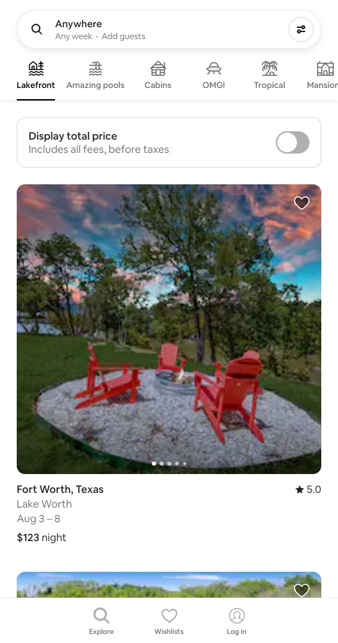
Airbnb (www.airbnb.com) is a great example of optimized website navigation with a clear and intuitive structure. The main categories are prominently displayed, allowing users to quickly identify and access the sections they are interested in. The labels used in the menu are straightforward and align with users’ expectations.

Streamlined Search Functionality
Airbnb places a strong emphasis on its search functionality, enabling users to find their desired accommodations efficiently. The search bar is prominently displayed at the top of the page, inviting users to enter their destination, travel dates, and other relevant filters. As users type, Airbnb provides real-time suggestions and auto-completion, making the search process faster and more intuitive. The search results page also offers additional filters and sorting options to refine the results based on users’ preferences.
Visual Appeal and High-Quality Imagery
Airbnb’s navigation incorporates visually appealing design elements and high-quality imagery, creating an engaging and immersive user experience. From the homepage to individual listing pages, the website utilizes visually compelling images and interactive elements that help users envision their travel experience. This attention to aesthetics enhances the overall user experience and makes browsing through listings a more enjoyable process.
Consistency and Accessibility
Airbnb maintains consistency in its navigation across different devices and platforms, ensuring a seamless experience for users. The website is designed responsively, adapting to various screen sizes, and optimizing the navigation for mobile devices. Additionally, Airbnb places importance on accessibility, ensuring that its website meets web accessibility standards, making it inclusive and usable for users with disabilities.

Take Away
Optimizing website navigation is crucial for enhancing the user experience (UX) of your website. By following the principles outlined in this article, you can create a simple and intuitive navigation system that allows users to find what they need quickly and effortlessly.
Remember to keep it simple, logically organize your content, provide clear calls-to-action, ensure responsiveness, implement search functionality, and maintain consistency across pages. By prioritizing user experience in your website navigation, you will not only satisfy your visitors but also increase engagement and conversions on your website.


