Imagine you’re shopping for a new outfit. You find one that you love but it’s not available in your size. The next size up would work but it looks sloppy in some places because there is too much material. Instead of letting you walk away disappointed, the sales associate suggests that you get the outfit tailored. That way, you walk away happy AND have a new outfit that fits you perfectly.
Now imagine that your new, tailored outfit has a superpower. It adjusts to your body every time you wear it! Gained a few pounds over the holidays? No problem, that outfit adjusts automatically to your larger size. Just got done doing a juice fast and feeling sleeker than ever? No problem, the outfit adjust automatically to your smaller size. Responsive design is just like that magical new outfit but for your website.
When your website is responsive, you’re essentially tailoring it to fit every device and screen size automatically. Just as the new outfit adapted to your body, responsive design makes sure that your website adapts to the device being used to view it. It looks good regardless of whether someone is using a smartphone, tablet, laptop, or desktop.
In this article, we’ll take a look at responsive design, explore its benefits, and key principles. I will also provide an actionable step you can take to ensure your website is responsive.
The Need for Responsive Design
As the variety of devices used to access websites continues to expand, it’s crucial for businesses and individuals to adapt their web design strategies. A website that functions well on a desktop but is virtually unusable on a smartphone can result in frustrated users and lost opportunities. This is where responsive design comes in, offering a solution that caters to the diverse needs of users across different devices.
One of the key drivers for responsive design is the continual rise in use of mobile devices to interact with websites. According to Statista (https://www.statista.com/statistics/277125/share-of-website-traffic-coming-from-mobile-devices/), mobile devices accounted for over 58% of global website traffic in the first quarter of 2023. A non-responsive website can deter mobile users from engaging with your content, leading to higher bounce rates and potentially impacting your site’s search engine rankings.
Key Principles of Responsive Design
Creating a responsive and mobile-friendly website involves adhering to several key principles that ensure an optimal user experience across devices
Fluid Grids
A fluid grid system is at the heart of responsive design. Instead of fixed pixel-based layouts, responsive designs use relative units like percentages to define the layout’s proportions. This allows the website’s content to adapt fluidly to different screen sizes, ensuring that elements are appropriately sized and positioned.
Flexible Images
Images are a crucial component of any website, but they can pose challenges when it comes to responsiveness. Using CSS techniques, such as setting a maximum width for images and ensuring they scale proportionally, helps prevent images from overflowing or distorting on smaller screens.
Media Queries
Media queries are CSS rules that apply different styles based on the device’s characteristics, such as screen width, orientation, and resolution. By using media queries, designers can tailor the presentation of their content to match the device’s capabilities, providing an optimized viewing experience.
Viewport Meta Tag
The viewport meta tag is a critical element in responsive design. It allows designers to control how a website is initially displayed on a device by setting the viewport’s width and initial scale. This ensures that users don’t need to zoom in or scroll horizontally to view content.
Progressive Enhancement
Progressive enhancement involves starting with a basic, functional version of the website that works on all devices and then adding more advanced features for devices with larger screens and higher capabilities. This approach ensures that the core content is accessible to all users.
Take Action!
Conduct a Mobile-Friendly Test
Google Mobile-Friendly Test
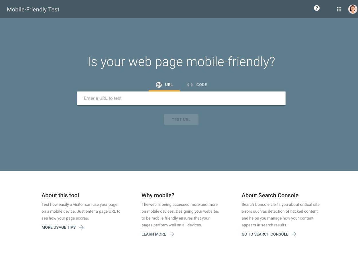
Google offers a free Mobile-Friendly Test tool (https://search.google.com/test/mobile-friendly) that allows you to assess how well your website performs on mobile devices. Simply enter your website’s URL into the tool, and it will provide you with a report that highlights any mobile usability issues.

The tool identifies problems such as text that is too small to read, content that is wider than the screen, and clickable elements that are too close together. By addressing these issues, you can make significant improvements to your website’s mobile-friendliness.
mobiReady
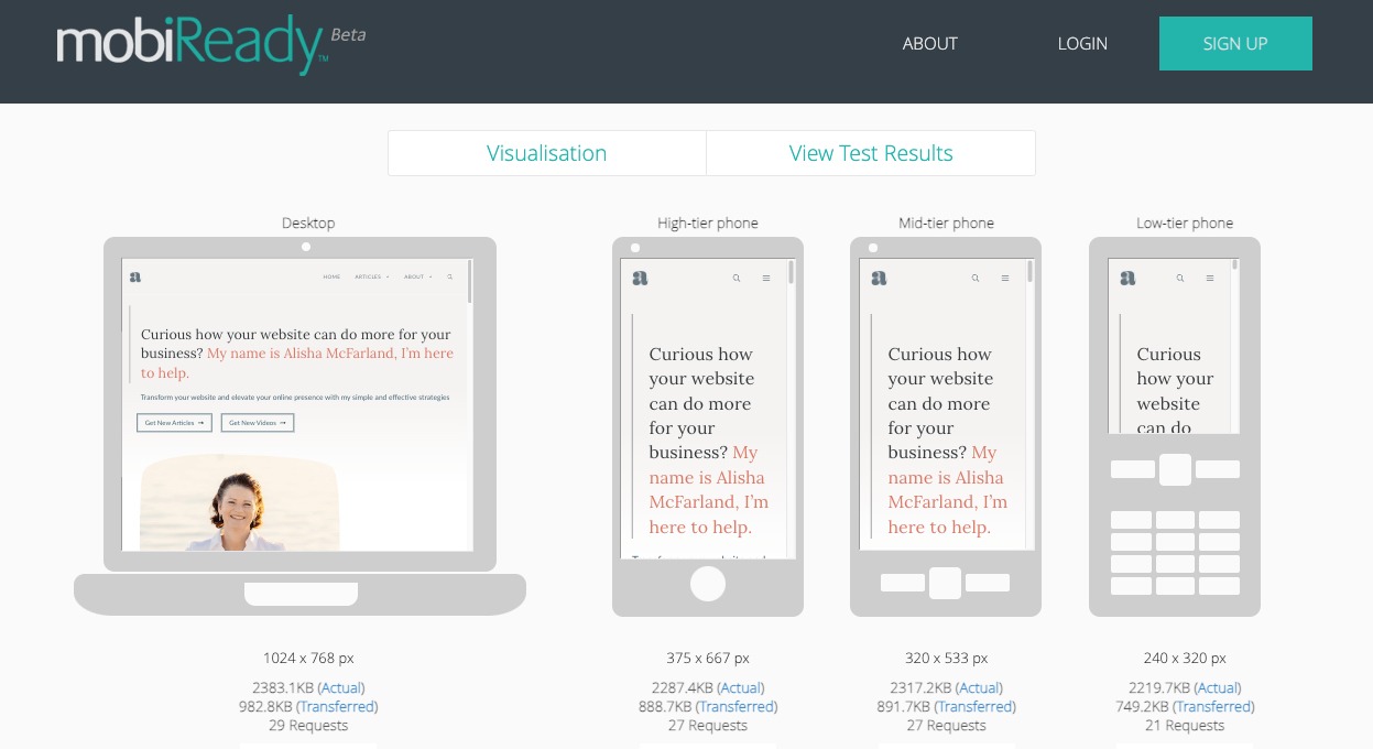
mobiReady (https://ready.mobi/) offers a free website test that gives you a visualization of how your websit looks on various devices. It also gives you a score between 1 and 5 along with a comparison to the scores of the top 1,000 Alexa sites for context.

Browser Developer Tools
Most browser’s offer developer tools that help you simulate how your website appears on different devices and screen sizes. This hands-on approach can help you identify and rectify design issues that may not be immediately apparent. The Inspect feature in Chrome will allow you to adjust the dimensions of the browser to simulate different devices that is quick and easy to use.
Take Away
As the number and types of devices continue to expand, responsive design will continue to be an essential part of creating engaging and user-friendly websites. By adhering to the principles of fluid grids, flexible images, media queries, viewport meta tags, and progressive enhancement, your website can seamlessly adapt to various devices and screen sizes. Taking action to ensure your website is responsive and mobile-friendly, such as conducting a mobile-friendly test, can lead to improved user satisfaction, increased engagement, and better search engine visibility.


