What’s the secret behind oh-so-clickable buttons?
Simple visual cues — subtle design elements that speak directly to human instincts and behaviors.
Read on if you want to learn three visual strategies that can transform ordinary buttons into irresistible click magnets!
Humans are visual beings.
Our eyes are naturally drawn to appealing designs and standout elements.
These standout elements – or visual cues – act as silent guides that direct our attention and influence our actions.
When skillfully incorporated into call-to-action buttons, these cues can play a crucial role in the split-second decision to click or scroll past.
Color Contrast
High contrast between a button and its surrounding elements can dramatically increase its visibility and, by extension, its clickability.
Color contrast creates a visual tension that naturally draws the visitor’s gaze.
A bright, bold button color against a more muted background instantly pops, making it nearly impossible to overlook—or click.
Use Contrasting Colors
Contrasting colors are noticeably different in hue, value (lightness or darkness), or saturation.
A red button on a white background takes advantage of each color’s different hues, values, and saturation.
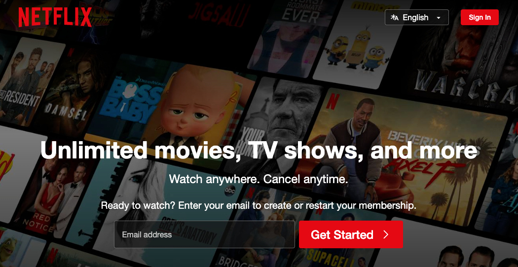
Netflix’s website has very clickable buttons!

Netflix has utilized three effective button characteristics:
- Color Contrast
- The buttons are bright red, standing out sharply against the dark background.
- Brand Consistency
- The red color of the button matches Netflix’s logo color.
- Simplicity
- The clear white text on the red background is simple and clean.
The goal isn’t just to make a button that looks good but one that gets clicked.
Size and Shape
Just like Goldilocks searching for the perfect porridge, aim for buttons that are “just right”—not too big, not too small, and shaped for optimal clickability.
- Rectangular
- Familiar and recognizable to most visitors
- Circular
- Stand out well for icons or single-character buttons
- Pill-shaped
- Modern and can expand to accommodate more text
The more a button looks like it can be pressed, the more likely visitors will interact with it.
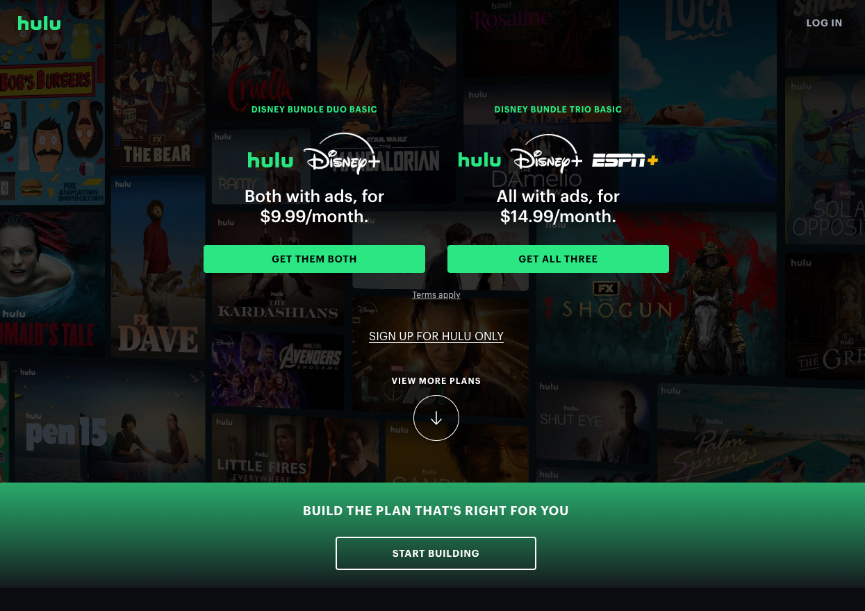
Hulu’s website has all kinds of button shapes!

Hulu’s webpage is an excellent example of using different button shapes for various purposes:
- The “GET THEM BOTH” and “GET ALL THREE” buttons
- Large, rectangular shapes with rounded corners.
- The main conversion buttons are designed to be prominent and easily clickable.
- The “START BUILDING” button
- Large, rectangular shape with rounded corners in an outline style.
- This differentiates it as a secondary action while maintaining a clear button appearance.
- The “SIGN UP FOR HULU ONLY” link
- Text without a button shape.
- Indicates it’s a less emphasized option.
- The “VIEW MORE PLANS” option
- Large, circular shape with a down arrow icon.
- This suggests that it will show more information when clicked.
Micro-interactions
Subtle animations and effects – known as micro-interactions – provide instant feedback to users. These small but mighty design elements can significantly enhance the visitor’s experience, especially concerning button interactions.
- Hover Effects
- Color change
- The button changes color when a cursor hovers over it.
- Glow or shadow
- A subtle glow or drop shadow appears on hover.
- Size change
- The button slightly enlarges or shrinks when hovered over.
- Color change
- Animations
- Click animation
- A quick “push” effect when clicking the button.
- Loading animation
- A spinner or progress bar to indicate processing.
- Transition effects
- Smooth color or shape changes between states.
- Click animation
- Cursor Change
- The cursor changes to a pointing hand over clickable elements.
- Tooltips
- Small text boxes appear on hover to provide additional information.
How Micro-interactions Work
- Immediate Feedback
- Instant confirmation that the visitor’s action has been recognized.
- This immediately satisfies the visitor.
- Affordance
- Visitors understand that an element is interactive before they even click it.
- This reduces uncertainty and encourages exploration.
- Emotional Connection
- Well-designed micro-interactions can be delightful.
- This creates a positive emotional response.
- Reduces Errors
- Clear visual feedback can prevent accidental clicks.
- Helps visitors understand the results of their actions.
Remember, micro-interactions aim to make your interface feel more human and responsive.
Take Away
Creating oh-so-clickable buttons is a delicate balance of visual appeal and human psychology. From the stark contrasts that catch the eye to perfectly sized and shaped buttons to the subtle micro-interactions that provide satisfying feedback, each element plays a crucial role in guiding behavior.


