With countless websites vying for user attention, streamlining the user experience has become more crucial than ever before. Among the many facets of website design, effective navigation stands out as a cornerstone for ensuring a seamless user journey. In this article, we’ll delve into the importance of streamlining user experience through optimized website navigation and provide actionable steps that businesses and individuals can take to enhance their own website’s navigation.
The Significance of User Experience
User experience (UX) is the heart of online interaction. It encompasses all the emotions, perceptions, and responses a user has while interacting with a website or an application. A positive user experience has the power to engage visitors, convert them into loyal customers, and foster brand loyalty. On the other hand, a poor user experience can lead to frustration, confusion, and ultimately, the abandonment of the website.
One of the most critical elements of UX is navigation. Imagine visiting a website and struggling to find the information you need – it’s frustrating, time-consuming, and can drive users away. Effective navigation is not just about making links clickable; it’s about guiding users seamlessly from one point to another, enabling them to effortlessly explore content, products, and services.
The Essentials of Streamlining Navigation
Clear and Consistent Menu Structure
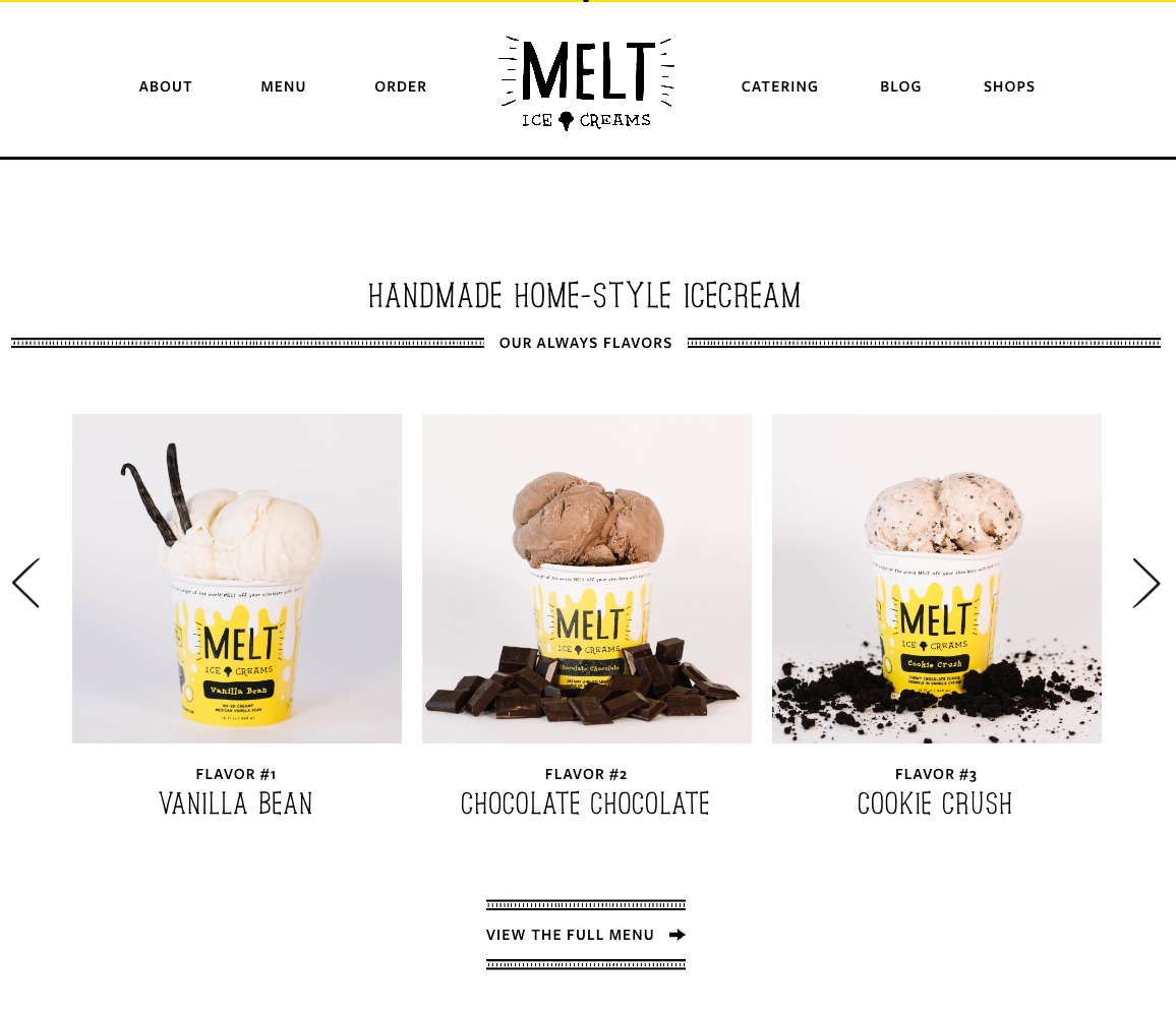
A well-organized menu structure is the foundation of easy navigation. The menu should be logically organized, with clear categories and subcategories that make sense to the user. Avoid overwhelming users with an excessive number of options – simplicity and clarity are key. Moreover, maintain consistency across pages to prevent confusion. Users should instinctively know where to find the menu and what to expect when they click on a category.
Intuitive Labels and Descriptions
The labels and descriptions used in navigation menus and buttons should be intuitive and straightforward. Users shouldn’t have to decipher cryptic terminology to understand what each option leads to. Use familiar words that align with the user’s expectations. For instance, if you’re running an e-commerce website, the shopping cart icon should be instantly recognizable.

Responsive Design
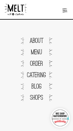
In today’s mobile-centric world, responsive design is a non-negotiable aspect of streamlined user experience. Your website should adapt seamlessly to different screen sizes and orientations, ensuring that users on various devices have a consistent and pleasant browsing experience.


Search Functionality
An efficient search function can be a lifesaver for users who know exactly what they’re looking for. Incorporate a prominent search bar that provides real-time suggestions and corrects misspellings. Additionally, ensure that the search results page is well-organized, displaying relevant content or products first.
Visual Hierarchy
Visual hierarchy refers to the arrangement of elements on a page to guide users’ attention. Utilize contrast, size, color, and spacing to create a clear visual hierarchy that directs users’ focus towards important elements, such as navigation menus, call-to-action buttons, and essential content.
User Testing and Feedback
Regularly seeking user feedback and conducting usability testing can reveal pain points in your website’s navigation. Gather insights from real users about their experiences and challenges. This data can guide you in making informed adjustments to enhance the overall user journey.
Actionable Steps for Streamlining Website Navigation
Improving website navigation might seem like a daunting task, but taking incremental steps can lead to significant enhancements. Here’s a simple actionable plan to get you started.
Step 1: Audit Your Current Navigation
Start by assessing your website’s current navigation structure. Identify any bottlenecks, confusing labels, or redundant links. Put yourself in the user’s shoes and navigate through the site, noting areas where you feel lost or frustrated.
Step 2: Simplify and Categorize
Streamline your menu by categorizing content logically. Remove any unnecessary links that don’t add value to the user’s journey. Prioritize the most important categories and organize subcategories accordingly.
Step 3: Optimize Labels
Review your menu labels and button text. Are they clear and concise, or could they be misinterpreted? Make adjustments to ensure that users can quickly understand where each link will lead them.
Step 4: Implement Responsive Design
Ensure your website is responsive and displays correctly on various devices. Test it on smartphones, tablets, and different desktop screen sizes. Make necessary adjustments to guarantee a seamless experience across the board.
Step 5: Enhance Search Functionality
If your website has a search bar, fine-tune its functionality. Integrate auto-suggestions, accurate spell-check, and a user-friendly results page. If you don’t have a search bar, consider adding one – it can greatly enhance user experience.
Step 6: Visual Hierarchy Check
Assess the visual hierarchy of your website’s pages. Use design elements to guide users’ attention to essential areas. Ensure that navigation menus and calls to action stand out without overwhelming the overall design.
Step 7: User Testing
Enlist a group of users to test your website’s navigation. Observe their interactions and gather feedback on their experiences. Use their insights to make refinements and improvements.
Take Away
A website with streamlined navigation is akin to a well-designed map – it guides users smoothly through the content and services, leaving them satisfied and more likely to return. By focusing on a clear menu structure, intuitive labels, responsive design, effective search functionality, and visual hierarchy, businesses and individuals can ensure that their websites offer a frictionless user journey.
As the online landscape continues to evolve, optimizing website navigation will remain a fundamental strategy for capturing and retaining the attention of discerning users. So, take action today and embark on the journey of enhancing your website’s navigation to provide a streamlined user experience.


