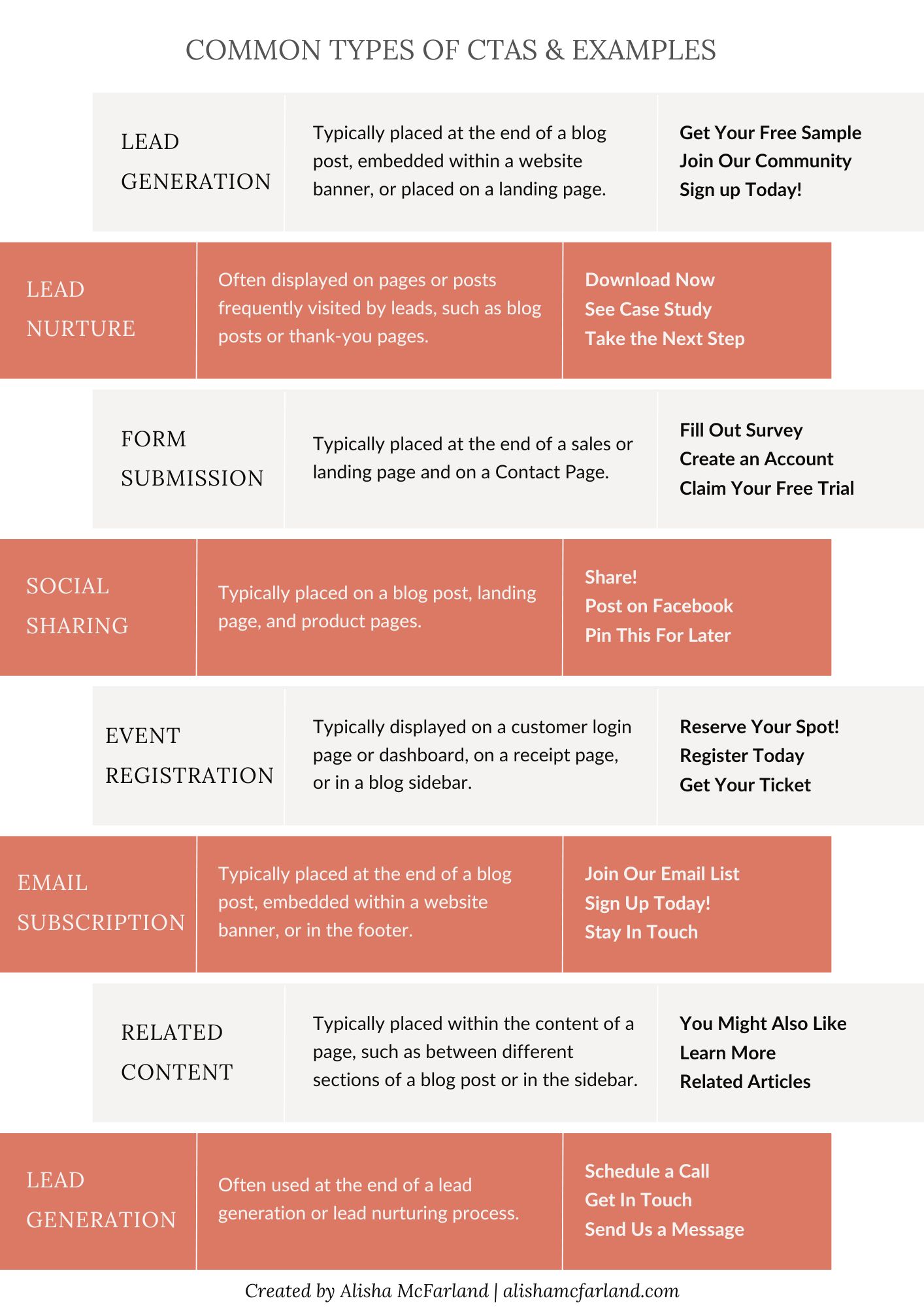
One of the most effective tools in engaging and converting website visitors into customers is the clear and compelling Call to Action (CTA). A well-crafted CTA can be the difference between a visitor merely browsing your site and one taking a desired action, such as making a purchase, signing up for a newsletter, or contacting your company. In this article, we’ll explore the power of clear calls to action on your business website and how they can significantly impact your online success.
The Anatomy of a Call to Action
Before talking about the power of clear CTAs, it’s essential to understand what they are and how they work. A Call to Action is a specific instruction or prompt designed to encourage a user to take a particular action. CTAs can take various forms, including buttons, links, or even plain text, but they all share some common characteristics:
- Clarity
- The CTA should be clear about what action you want the user to take.
- Ambiguity can lead to confusion and decreased engagement.
- Visibility
- It should be easily noticeable on the page.
- Use contrasting colors, appropriate size, and strategic placement to make it stand out.
- Conciseness
- Keep your CTA short and to the point.
- Use action-oriented verbs like “buy,” “subscribe,” or “download.”
- Value Proposition
- Convey the benefit or value the user will receive by clicking the CTA.
- Explain why taking the action is in their best interest.
- Relevance
- Ensure that the CTA is contextually relevant to the content on the page.
- It should flow naturally from the information presented.
- Design
- The design of your CTA, including its color, shape, and style, should align with your brand and website’s overall aesthetics.
The Influence of Clear CTAs on User Behavior
Now that we understand the essential elements of a CTA let’s explore how clear CTAs can influence user behavior on your business website:
Guiding User Journey
Clear CTAs act as signposts on your website, guiding users along the desired path. They eliminate guesswork by explicitly stating what step to take next. Whether it’s “Shop Now,” “Get Started,” or “Contact Us,” these cues help users navigate your site and take meaningful actions.
Increasing Conversion Rates
The primary goal of any business website is to convert visitors into customers or leads. Clear CTAs play a pivotal role in achieving this goal. Studies have shown that websites with well-designed CTAs experience higher conversion rates. When visitors know precisely what action to take, they are more likely to follow through.
Reducing Bounce Rates
Bounce rate refers to the percentage of visitors who navigate away from your site after viewing only one page. High bounce rates can be detrimental to your online success. Clear CTAs can entice visitors to explore more of your website, reducing bounce rates and increasing the chances of conversion.
Building Trust and Confidence
A website with clear CTAs demonstrates professionalism and clarity in its communication. This builds trust and confidence in visitors. When users feel confident about what to expect and how to proceed, they are more likely to engage with your brand.
Enhancing User Experience
User experience is a critical factor in any website’s success. Clear CTAs contribute to a positive user experience by simplifying the decision-making process. When users can quickly identify and act on CTAs, they interact more efficiently with your site.
Supporting SEO Efforts
Search engines consider user engagement metrics when ranking websites. A website with a low bounce rate and high conversion rate signals to search engines that it provides value to users. This can positively impact your search engine rankings, making your website more discoverable to potential customers.
Best Practices for Crafting Effective CTAs
To harness the power of clear CTAs, consider the following best practices when crafting them:
- Use Action-Oriented Language
- Use action verbs that encourage users to take immediate action.
- For example, “Buy Now,” “Subscribe Today,” or “Get Your Free Trial.”
- Create a Sense of Urgency
- Incorporate phrases like “Limited Time Offer” or “Act Now” to create a sense of urgency and motivate users to act promptly.
- Highlight Benefits
- Explain the benefits or value users will receive by clicking the CTA.
- Make it clear why taking the desired action is in their best interest.
- A/B Testing
- Experiment with different CTAs to determine which ones resonate most with your audience.
- A/B testing allows you to refine your CTAs over time.
- Mobile Optimization
- Ensure that your CTAs are easily clickable on mobile devices.
- Mobile optimization is crucial in increasing users’ access to websites via smartphones and tablets.
- Placement Matters
- Consider the placement of your CTAs carefully.
- They should be strategically positioned where users are most likely to see and interact with them.
- Consistency Across Pages
- Maintain consistency in the design and language of your CTAs across all website pages.
- This helps reinforce your brand identity.
Take Away
CTAs are not merely buttons or links; they are the bridges that connect your visitors with your business goals. When crafted with care and precision, they can guide users, boost conversions, and ultimately contribute to the success of your online objectives.
Remember the fundamental elements of clear CTAs: clarity, visibility, conciseness, value proposition, relevance, and design. By implementing these principles and continuously optimizing your CTAs based on user behavior, you can create a website that attracts visitors and compels them to take the actions that drive your business forward.


